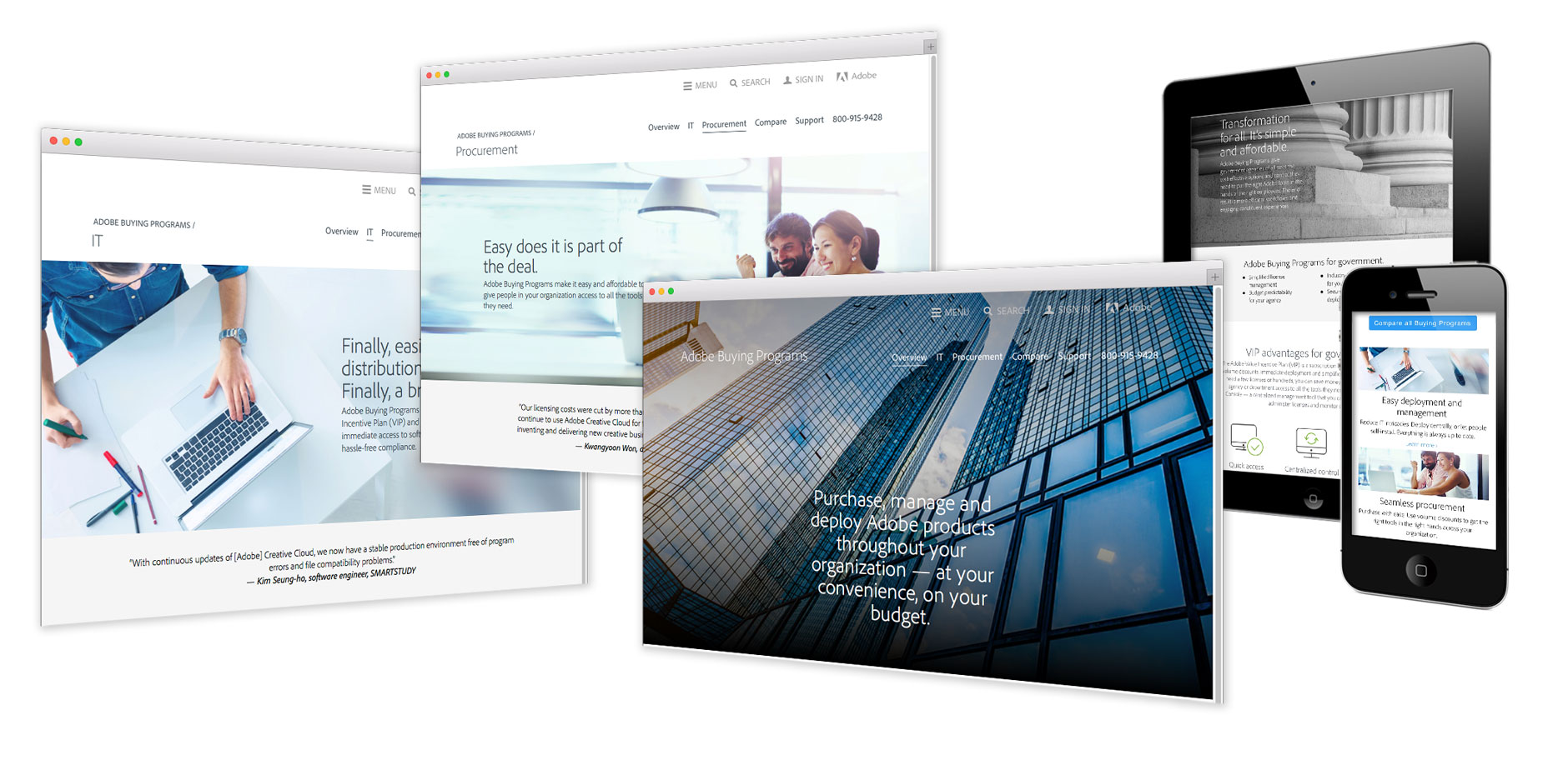
Volume Licensing section of Adobe.com

Our client’s story
In order to effectively communicate information about its volume licensing programs, Adobe needed to create a well-organized and engaging section of its corporate website. The new web pages needed to follow the look and feel of Adobe.com, provide the latest program information, and appeal to a variety of audiences across industries — as well as to different organization types and sizes. Most importantly, the key features of the different programs needed to be displayed in easy-to-understand charts and diagrams.

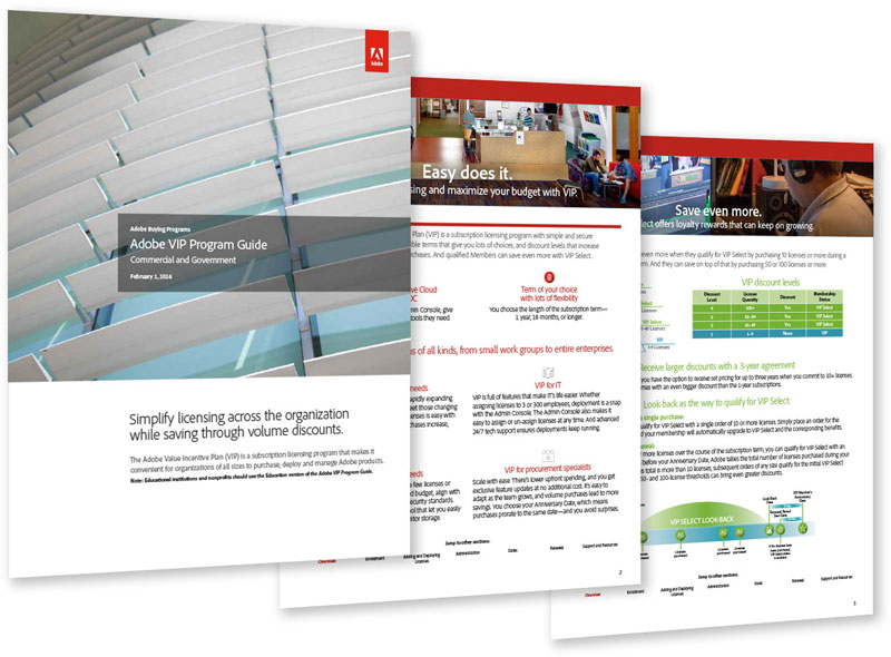
Scott Design met with the Adobe team to review all the program changes and key features and benefits. Scott Design wrote all the copy for the 10-page section and provided design direction — following branding and creative guidelines. The content and imagery appeals to the specific audience for each page (Enterprise, Education, IT, Procurement, etc.). We created infographics and charts to be used on the website and in supporting marketing and sales tools. Scott Design also updated a full set of program guides for customers and resellers.
The new section on the website allows Adobe to educate site visitors about the different volume licensing programs and directs customers to the plan that makes the most sense for their organizations. The clear, concise copy —presented in organized sections supported by icons and images — helps volume licensing customers to more quickly and effectively engage with Adobe.
View the Adobe Buying Programs website ›