5 steps to successful event design
Although much of our business (and our lives!) take place online, we still need to connect in person every now and then.
Whether it’s at a business trade show, an educational conference, a nonprofit fundraiser, or a gathering around a common interest, design can play a huge part in creating a cohesive, engaging, successful event. The design could be for a single conference, a virtual or hybrid event, or for the graphics in your trade show booth used throughout the year. In every case, the visual design is an opportunity to give attendees a consistent, seamless, high-quality experience with your brand.

1. Keep it simple
 Designing for most events or a trade show booth usually isn’t about glitz and glamour. It’s about creating a core concept and set of visuals that can be used to support your message and branding. Figure out what the objective is: branding, splash, engagement, learning, etc. Your graphics should help to further your messaging, while making attendees excited about the chance to interact in the environment you create. Start with a simple color palette, distinctive graphics, and a concise message easily deciphered from across a room. With thoughtful use of unique graphics and a short, to-the-point message, you can communicate your message easily to your audience in just seconds.

2. Be consistent and on-brand
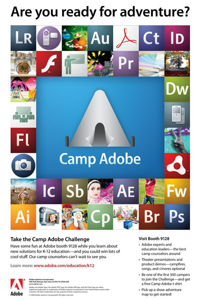 Once you have your theme and supporting graphics and messages, be sure to keep the look and feel consistent and on-brand. Whether the style is modern, friendly, fun, welcoming, imposing, or stark, each piece should work together to create a unified look. A one-time event can provide the opportunity to take corporate guidelines and have a little fun with them, using the company’s style as a base but expanding to create a design more about a single experience, and less about long-term branding. If the graphics are for a booth that will be used many times, you can still create a unique feel to showcase a different aspect of your organization’s personality, while still remaining on-brand.

3. Design for flexibility
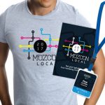 Conference and event graphics should be simple and flexible enough to extend to all media, all sizes, and pieces used before, during, and after the event. The graphics you create may be used in every shape and size before you’re done, so don’t paint yourself into a corner by designing something that works only in a horizontal format or that is created at web-resolution only. The most flexible format is a visual that can be used in square, vertical, and horizontal implementations, and is vector-based so it can be sized up as big as you need.
Almost as good is a set of graphics that are different shapes, but match to create a consistent look-and-feel, and are created at high-resolution. Think about all the places your event graphics might be used and plan accordingly: website, emails, flyer, post card, signage, name badges, Facebook, Twitter, LinkedIn, Eventbrite, banner ads, registration page, landing page, program, invitations, survey, virtual rooms, PowerPoint presentations, landing page, t-shirt, app, SnapChat, Instagram, SlideShare, Periscope, YouTube, Livestream, tchotchkes, and more!

4. Make social media a priority
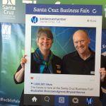 Great experiences at events can have bigger reach if you make it easy for attendees to share socially. Display the event hashtag prominently on all materials, create transparent PNGs with the logo and/or hashtag that can be overlaid on any photos or images shared by your organization during the event, and incorporate an event hashtag and any appropriate presentation-specific hashtags on all PowerPoint presentations. Create web-optimized graphics ahead of time that the social media team can share periodically during the event on Twitter, Instagram, LinkedIn, Facebook, and other platforms. Have on-brand visuals ready for Facebook Live, Google Hangouts, Periscope, or wherever you are live streaming. The goal is to make sure that the team has a library of visuals ready to share, and the audience knows how to share them.
5. Focus on attendee experience
 Your event or booth will be judged from the minute attendees arrive and start noticing the details, making assumptions based on look and feel, how easy it is to find information they need, connect, engage, and share. Design name badges to make them easy to read; create signage to make it simple to navigate the venue; provide easy-to-read schedules so attendees know what’s coming up next; and provide a quick-read program to find information on presenters, your organization, and sponsors. Design opportunities for attendees to interact with your company and each other to build a more memorable experience.
Consider creating something that people would like to include in their selfies, let them test-drive your product or service, or create a challenge that attendees can solve. Think about getting the team that will be working the event or staffing the booth involved in developing the on-site experience. In all of these, tie the design back to the overall style and objectives.
Bottom line
Every event is a chance to build on the experience that your audience has with your brand or organization. From the pre-event communications to the on-site experience to the follow-up interactions, your event should be designed with a simple, consistent look and feel that supports your core message. Use great design to get attendees to the event, help them navigate their day, give them something worth sharing, and engage them with your organization in new and deeper ways. You’ll create community and engagement from the moment someone registers and throughout the event and beyond.