6 best practices for email preview text
Customize your preheader text to improve email open rates
 Getting someone to open your email is one of the biggest challenges of email marketing. Subscribers spend just a few seconds before deciding whether to read your message or just delete it. There’s a great tool to grab a reader’s attention that many organizations that send out marketing emails are not using effectively: preheader text.
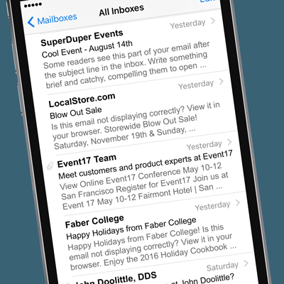
If you don’t insert preheader text in the code of your email, most email clients — all apps except old versions of Outlook, Lotus Notes, and Blackberry — automatically pull a preview from the first 75-100 characters of your email’s content. This text is displayed right after the sender name and subject line, so it’s a valuable opportunity to engage your recipients, one of the most effective ways to increase open rates, and can create problems if you don’t write your emails with this in mind.
Best practices for email preview text
Following are 6 ways to customize and craft preview text to entice readers to open up your email, and some actual emails (names changed, of course) that could have used some preheader love.
#1: Don’t leave it empty
Make sure you at least put something in the preheader. The example below shows what happens when you use Constant Contact and don’t fill in the preview text. Pretty catchy, eh?

#2: First things first
If you don’t add preview text, at least make sure the very first thing a reader sees is compelling, not your address, which you can put at the bottom of the email. (Though, it might be a challenge to create a compelling message from your dentist….)

layout classes=”halves”
#3: Who reads online?
How many people would list their “email not displaying correctly” in the 10 ten worries of the day? Probably no one. Put that “read online” link later in your email, after the good stuff.

#4: Start with a headline
Think about the start of your email and make sure it is easy to decipher if your subscriber only sees the first 75-100 characters. A tagline or descriptor of the event would be a great start to an event email, both for the preview text and for starting off any event email.

layout classes=”halves”
#5: Don’t repeat yourself
Don’t repeat the sender name and subject line in your preheader text. Think how the sender name, subject line, and preview text can work together to catch someone’s attention with a second and third reason to click open the email.

#6: Read critically
Test your email subject line and preview text to see how it reads. The email above might seem funny to whoever wrote it, but it contains the word “warning” followed by an alert that the message contains something that sounds ominous, and the words “escape” and “madness.” With a random “Ho Ho Ho Ho” thrown in. The one enticing word is “enjoy,” but before I even got there, I deleted this scary email.

Chances are your subscribers are deciding whether to read your email in just a few seconds by looking at the sender name, the subject line, and the preview text. Don’t miss the chance to strengthen the story you started with the subject line by crafting compelling, interesting, informative preheader text. Use the preview text to tell readers what the email is about, why it’s relevant, support your subject line, and help make sure readers don’t delete your email…or click the “spam” or “junk” button.


