How does Google decide if your site is mobile-friendly?
Google’s goal in serving up search results is to make sure you get the best answer to your search. If you are on a mobile device, Google ranks mobile-friendly websites higher in search results because they think a mobile-optimized website is a better “answer” than a non-optimized site.
So how does a website earn the “mobile-friendly” label? There are four main criteria Google uses:

- The website avoids software that doesn’t usually work on mobile devices.
Avoid using Flash or any other plug-ins that are not common or are not designed for handheld device, as they will result in a broken link or a blank page. And, a blank stare as your users leave your website for someone else’s mobile-friendly site. An experienced mobile website designer can achive most of the functionality you need without plug-ins.

- The website uses text that is a readable size.
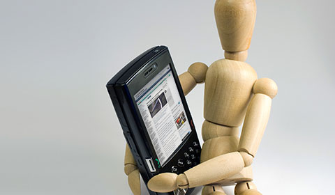
If a site isn’t optimized for mobile, the device simply sizes down the website to fit in the view screen. I call this the dollhouse website, sized for a doll, not a human. Your text becomes tiny and a user has to pinch or zoom in order to read the content. A mobile-friendly website, with legible type, reduces frustration and site abandonment.

- The website lays out content on the screen so users don’t have to scroll horizontally or zoom.
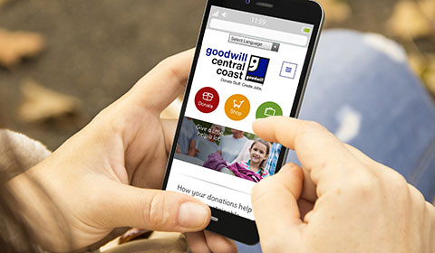
A website designed for a horizontal layout, as on a desktop computer, requires a user to zoom in and then scroll around the page to see everything on a phone. A responsive website determines the size of the view screen of the device and reorganizes the content so that a viewer can quickly scroll through the entire page without zooming. Content is stacked in a tall, narrow column, creating a long page that is navigated by swiping up and down. Logos, images, and type are all sized for easy viewing on the screen.

- The website places links far enough apart so that the correct one can be easily tapped.
Google checks to make sure that any links on your site, including text links and buttons, are spaced out so that it is easy to tap them. If you are using buttons, be sure that they are large enough for an adult’s finger to tap without hitting two at once. Don’t forget to place phone numbers and addresses far apart, as most phones turn these into links to allow you make a call or get directions with a single tap.
Once your site earns the mobile-friendly label, it will earn higher ranking than similar sites that are not optimized for mobile. And, more importantly, if you design your site with an eye towards earning Google’s mobile-friendly designation, you will create a better user experience for your customers.