So you want to send that from Outlook?
Don’t expect miracles.
 When clients ask us if they should send out their HTML mails via Outlook, our basic advice is usually, “Don’t.” You should really use a dedicated email service provider like Constant Contact or Mail Chimp.
Out of the box, Outlook’s limitations are so monumental that, chances are, your HTML emails will end up looking bad. The best you can hope for, really, is that they end up looking OK. They won’t look great, but they might be ”good enough.” You have to ask yourself if good enough is good enough for your company and your brand.
Send Personally
![]() If you’re on Windows, and want to send HTML emails from Outlook, you should definitely buy Send Personally, which will prevent Outlook from trashing your HTML. You can even send responsive emails using Send Personally. (You’ll still need an HTML editor like Adobe Dreamweaver to craft your HTML, but at least it won’t be lobotomized when you try to send it.) A single license costs $24, and they offer volume discounts. Sadly, Send Personally is Windows-only: If you use Outlook on a Mac, you’re out of luck.
If you’re on Windows, and want to send HTML emails from Outlook, you should definitely buy Send Personally, which will prevent Outlook from trashing your HTML. You can even send responsive emails using Send Personally. (You’ll still need an HTML editor like Adobe Dreamweaver to craft your HTML, but at least it won’t be lobotomized when you try to send it.) A single license costs $24, and they offer volume discounts. Sadly, Send Personally is Windows-only: If you use Outlook on a Mac, you’re out of luck.
What’s a marketer to do?
If you’re on a Mac, or if your IT department won’t let you install Send Personally, here a few tips that will help your Outlook-sent HTML emails look as “good enough” as they can on both desktop and mobile.
First of all, Outlook doesn’t do responsive design. It doesn’t understand it when you send a responsive layout to Outlook, and it sure as heck doesn’t know what to do when you try to send a responsive email from Outlook. This means that you’ll need to make some compromises to make sure that your emails work on both desktop and mobile. The goal should be to create a layout that looks good enough on a very narrow screen (a phone) and on a wide screen (a computer).
Liquid layouts
If you can, I recommend using a liquid layout rather than a fixed-width one. Just set the width of your content to 90%, keep your images small, and your email should work on both phones and desktop computers. Click here to see an example of a liquid layout.
Fixed-width layouts

Narrow your focus
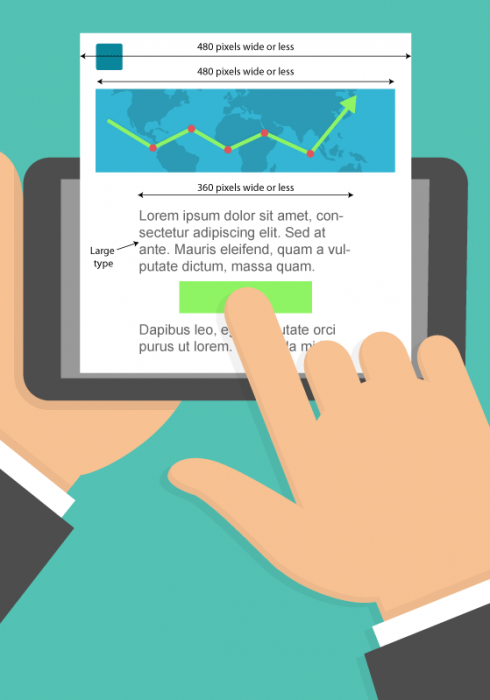
If you make your layout wider than 480 pixels, you’ve ensured that all your customers on phones will have to pan and zoom to read your email, even in landscape mode. Therefore, we recommend a maximum width of 480 pixels.
Avoid full-width images
If you want to use images in your email — and, really, what marketing email has no images? — avoid wide images. When sending HTML emails with Outlook, you need to let go of the idea of pixel-perfect layouts as Outlook treats the images and copy differently. The same version of Outlook will look completely different on different computers. On high-resolution displays, Outlook makes the text size larger. However, it doesn’t also bump up the size of images. So, a full-width image is no longer actually full-width, but instead has a lot of space on either side of it; or a small image that balances so nicely next to a block of text in your browser is suddenly dwarfed by your large-size copy.
Narrow column/Large type/Wide margins
If you have a full-width image, you’ll need to make your text larger than you normally would on desktop, so that it’s not too small on phones when you double-tap to fit the email in the window. We also recommend having a narrower-than-usual column of text with wider margins. Typically, if we have a 480px image, we’ll have 60 pixels of margin on either side of our (larger type) text, which leaves a 360 pixel wide column of text. This is slightly wider than your phone, but with the larger text, double-tapping it should make your text fill the screen and be legible.
In the end, is it worth it?
So, what are the takeaways? If you can, use an email service provider. If you need to use Outlook, install Send Personally to prevent Outlook from mangling your code. If you need to use Outlook “out of the box,” consider a liquid layout, or if you want a fixed layout, avoid wide images, make your text large, set your copy in narrow columns, hope for the best, and repeat after me: good enough is good enough.