We asked our colleagues if they check their business-related emails on their phones. The results confirmed the reports: Most respondents, regardless of their age, use their phones, tablets, and other mobile devices to check both their personal and work emails.
Tag: responsive
Websites, emails, apps, and landing pages optimized for desktop computers, laptops, tablets, and smartphones
WordPress website for structural engineer
McHale Engineering has years of experience, but didn’t have an online presence for reaching architects, commercial builders, and homeowners.
15 for ’15
Clients often ask us where we think they should focus their marketing efforts to make sure they are hitting all the right targets. As the year comes to a close, here are 15 things we think you should consider for next year. They represent our top five recommendations each for 2015 for digital marketing, marketing communications, and branding strategy.
K-12 education product launch and website design
When Teaching Channel decided to monetize its solution, the company needed a new site and materials to reach K-12 educators.
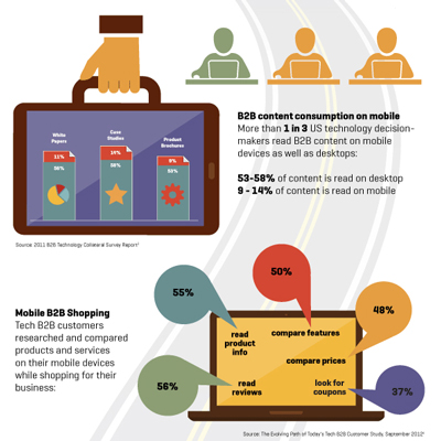
Top 5 B2B Mobile Myths [Infographic]
Think your B2B customers aren’t using mobile devices to visit your website and read your emails? Wrong! Here are the top 5 most common misconceptions about B2B mobile users.
Interactive product selector wins B2B and microsite awards
Multiple awards for a B2B microsite
10 tips for successful B2B landing pages
Make the effort to optimize your landing pages, remembering that the user experience there is as important as the initial email. A dedicated, on-brand responsive landing page with a simple registration form can make all the difference.
Top 10 online marketing trends for 2014
With 2014 just beginning, it’s a good time to examine some of the hottest trends in online marketing and web design. Here’s our take on the most relevant technologies and strategies to watch and implement this year.
Responsive email design
With so many users viewing sites on smartphones and tablets, ensuring engaging mobile experiences has become essential. Now, the responsive design strategy is being applied to emails, since more and more users worldwide view emails on mobile devices.
B2B Mobile Use infographic wins gold
Gold Marcom award in the infographic category
Designing responsive websites
From a web designer perspective, responsive design provides new challenges. Establishing a look and feel for the site is just the beginning. A design team should think about the different experiences for each user (laptop, desktop, tablet, and phone) and determine what’s optimal for each.
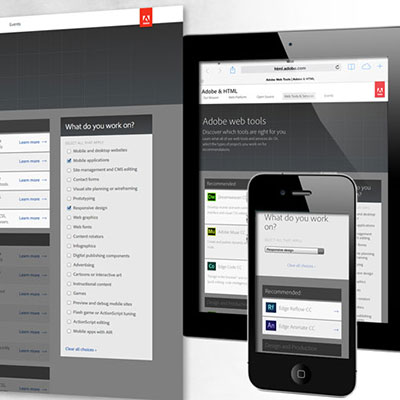
Adobe Web Tools Selector
Helping customers figure out which software is best for them can be challenging, unless you have an online tool that provides instant recommendations.


