Why tables for layout is stupid: Updating a fan favorite
“Why tables for layout is stupid” has been one on our most popular articles since it was published in 2004, with hundreds of thousands of visits and 24 international translations. Since more people access the web on their phones than from their desks and Google rewards mobile-ready sites, we decided it was time to update “Stupid Tables” to make it responsive.
Ready for a refresh.
11 years on the web is an eternity: Internet connections and computers are faster; desktop browsers are much better; and more people now access the web on their phones than from their desks. This last fact (and a gentle nudge from Google Webmaster Tools) led us to update “Stupid Tables.
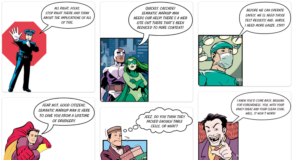
The stars of our show
When I first laid out the presentation, I went back and forth as to whether or not put the illustrations into the markup of the pages, or to place them as background images with CSS. In the end, I reasoned that they were ornamentation, rather than actual content, so I used CSS to place them in the background.
In retrospect, I wish I had chosen to put them into the pages, not just because it would have made updating the site easier, but also because it would have made the images accessible to people with low vision. And besides, when you get right down to it, the cartoons are the stars of the show. (Many web standards gurus had written eloquently about the need to switch web-coding practices, but none of them had used humor to get their points across.)
Mobile-friendly, here we come.
My first task was to move all of the cartoons out of CSS and into HTML. Since the dimensions of all the images vary considerably, the navigation had to be positioned to account for the varying heights of the images. Moving the images into the HTML was easy enough for the English version, but I also had to do so for the 17 translations that we host on our site. Luckily, the code for these translations matched the original version fairly closely, so it only took a few hours to update all the pages in those versions too.
Once the images were in the markup, it was easy enough to add a few media queries and start making the pages responsive. Now the images resize according to the width of your browser. When you’re on a phone, the text follows the images, and the navigation is easily accessible at the bottom of every page.

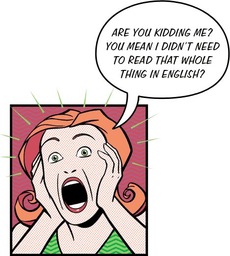
Fun to read, even if you’re not a web designer. And, even if you don’t speak English.
The presentation was designed for both web developers and the execs and marketing professionals at the companies where they work, so it’s a great read for anyone interested in best practices in web design. You can view the complete presentation all on one page, or enjoy it in bite-sized nuggets, or enjoy one of the 24 international versions.