Sideshow barker

Why tables for layout is stupid:

problems defined, solutions offered

Tables existed in HTML for one reason: To display tabular data. But then border="0" made it possible for designers to have a grid upon which to lay out images and text. Still the most dominant means of designing visually rich Web sites, the use of tables is now actually interfering with building a better, more accessible, flexible, and functional Web. Find out where the problems stem from, and learn solutions to create transitional or completely table-less layout.

Yuppie holding a cigar

Go get your boss

Are there any "suits" in the audience? Are your bosses here at Seybold, but attending a different session right now? Go get them. They are the people who need to know how Web standards can save your company money.

Plumber with a toliet plunger

Overview: What’s in it for me?

We'll give you an introduction to a way of working that will

We'll also talk about how laying out pages with Cascading Style Sheets (CSS) requires a slightly different way of thinking about your content and your markup than you may be used to.

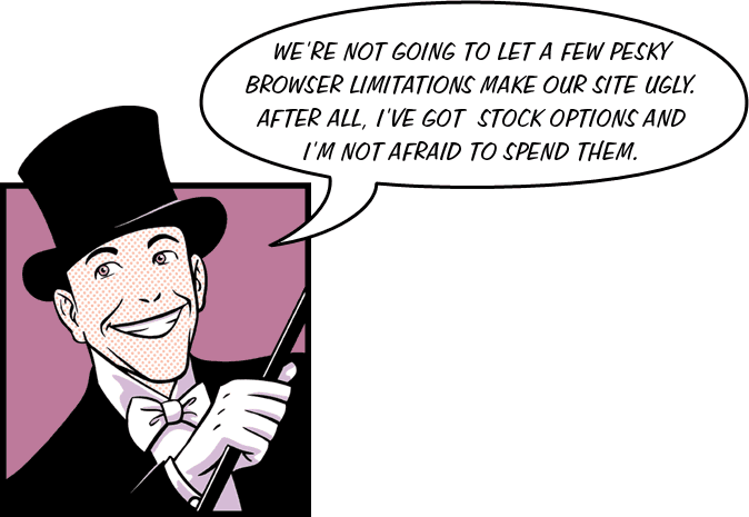
Man in a top hat, tuxedo, and white tie

Killer Web Sites: nested tables and spacer GIFs

In the beginning, the Internet was primarily a medium for academics, researchers, and the military to share information. However, it didn't take long for entrepreneurial visionaries to realize that this new medium was ideal for selling everything from fresh produce and dogfood to used cars and streaming sports coverage.

However, as with any medium in its infancy, the early Internet was aesthetically ‘crude’ (and not really all that enticing to consumers) until David Siegel published his landmark book, which offered some brilliant workarounds for the limitations of existing browsers and W3C specs circa 1997. (We're talking Netscape 2 and 3, folks.)

These workarounds were so brilliant, in fact, that they are still the most prevalent method of laying out Web pages today.

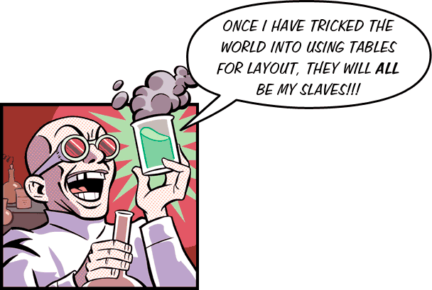
Mad scientist hatches his evil plot

The problem with using tables:

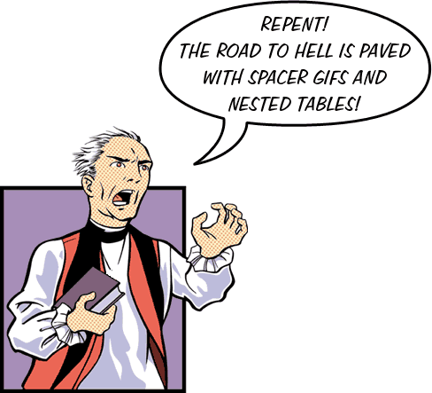
Preacher testifying to the mortal danger of using tables for layout

Salvation is at hand

Modern browsers are much better at rendering Web standards and we don't need to use these archaic methods any more.

Instead of nesting tables within tables and filling empty cells with spacer GIFs, we can use much simpler markup and CSS to lay out beautiful sites that are faster to load, easier to redesign, and more accessible to everyone.

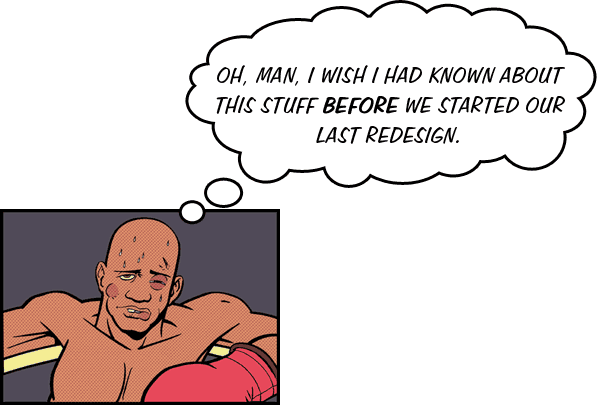
Boxer exhausted between rounds of a fight

The solution: CSS and structural markup

By using structural markup in our HTML documents and Cascading Style Sheets to lay out our pages, we can keep the actual content of our pages separated from the way they are presented.

This has several advantages over using tables....

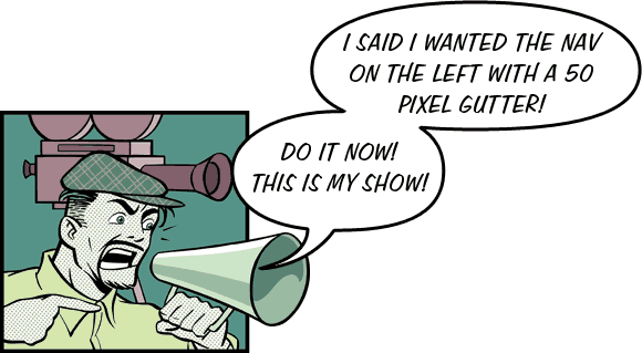
Film director shouting at his crew

Redesigns are easier and less expensive

By removing presentational markup from your pages, redesigns of existing sites and content is much less labor intensive (and much less expensive). To change the layout of the site, all you need to do is change the style sheets; you do not need to edit the pages themselves at all.

For example, check out the CSS Zen Garden, or the style switchers on Eric Meyer’s site. To learn more, see Alternative Style by Paul Sowden.

Reporter grilling a lawmaker about his website

Bandwidth ain't free

Using Web standards reduces the file sizes of your pages, as users no longer need to download presentational data with each page they visit. The Style sheets that control layout are cached by viewers' browsers.

Reduced file size means faster loads and lower hosting costs.

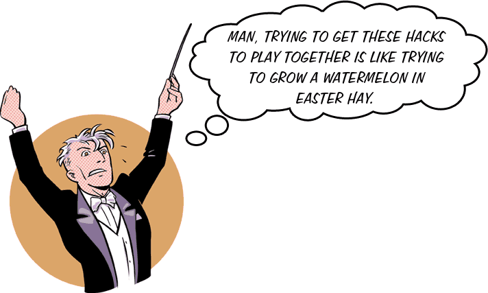
Sweating orchestra conductor

Hey, these pages all look like each other!

Using Web standards also makes it extremely easy to maintain visual consistency throughout a site. Since pages use the same CSS document for their layout, they are all formatted the same.

This strengthens your brand and makes your site more usable.

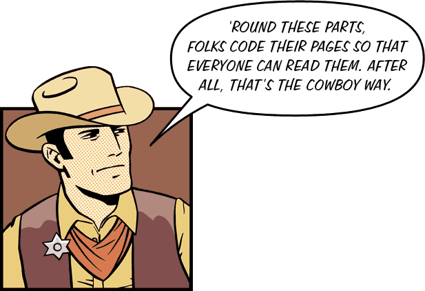
Cowboy talking about the importance of accessibility

Write once, use anywhere, for everyone

Using Web standards makes our pages much more accessible to users with disabilities and to viewers using mobile phones and PDAs to access the Web.

Visitors using screen readers (as well as those with slow connections) do not have to wade through countless table cells and spacers to get at the actual content of our pages.

In other words, separating content from the way it is presented makes your content device-independent.

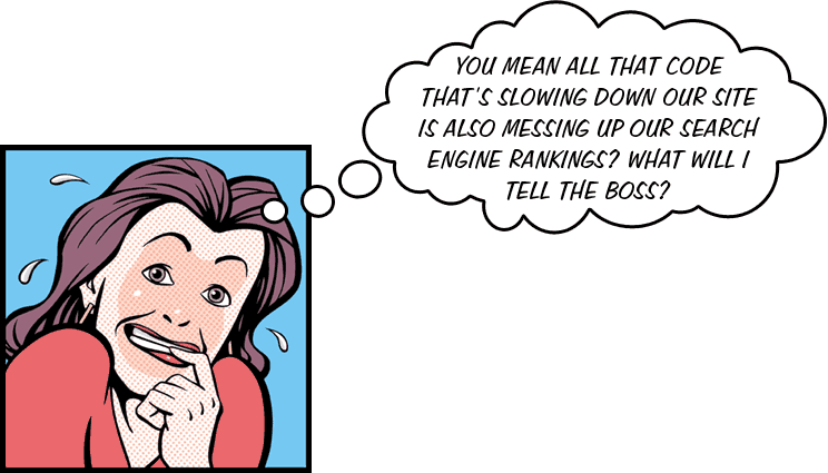
Woman freaking out because her markup is ruining her SEO

Google is blind

Speaking of accessibility, minimizing your markup and using header tags properly will also help improve your search engine ranking.

Reducing the ratio of code to content, using keywords in your header tags, and replacing header GIFs with actual text will all help your sites get better search engine results.

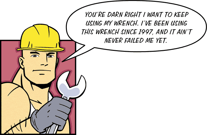
Construction worker committed to using his old tools

You can still use tables if you need to, just don't use so many of them

This will give viewers (and bosses) who are bound and determined to use version 4 browsers until the day they die an acceptable approximation of what the rest of the world is seeing.

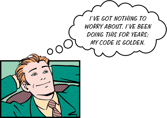
Overconfident yuppie not worried about his code

A pleasant enough looking table

Lorem ipsum dolor sit amet, consectetuer adipiscing elit.Sed diam nonummy nibh euismod tincidunt ut laoreet dolore magna aliquam erat volutpat. Ut wisi enim ad minim veniam, quis nostrud exerci tation ullamcorper.
Suscipit lobortis nisl ut aliquip ex ea commodo consequat.Duis autem vel eum iriure dolor in hendrerit in vulputate velit esse molestie consequat, vel illum dolore eu feugiat nulla facilisis.
At vero eros et accumsan et iusto odio dignissim qui blandit
Praesent luptatum zzril delenit augue duis dolore te feugait nulla facilisi.
Qui blandit praesent luptatum zzril delenit augue duis dolore te feugait nulla facilisi.Diam nonummy nibh euismod tincidunt ut laoreet dolore magna aliquam erat volutpat.
Epsum factorial non deposit quid pro quo hic escorol.
Olypian quantels et gomilla congolium sic ad nauseum. Souvlaki ignitus carborundum e pluribus unum. Defacto lingo est igpay atinlay.
Eu feugiat nulla facilisis at vero eros et accumsan et iusto odio dignissim.Lorem ipsum dolor sit amet, consectetuer adipiscing elit, sed.
Ut wisi enim ad minim veniam, quis nostrud exerci tation ullamcorper suscipit lobortis nisl ut aliquip ex ea commodo consequat.
Duis autem vel eum iriure dolor in hendrerit in vulputate velit esse molestie consequat, vel illum dolore.
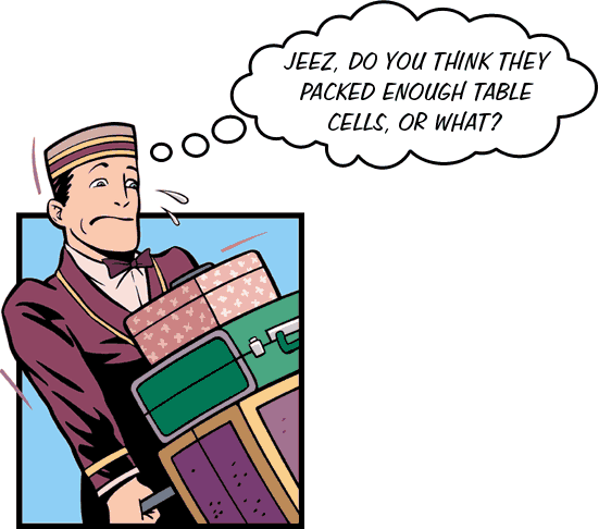
Bellboy struggling

Take a look beneath the surface

This could really be done much more simply.Guess how much markup there is in this little table? 13.7k. There are 17 rows and 9 columns in this thing. And did I mention all of the spacer GIFs?
There are way too many table cells and spacers in here.And all of the dotted borders are done with a background attribute on table cells, which won't validate.
A nested table? What for?
To make a bulleted list? You're kidding, right?
This could all be done with 8 table cells and 4 CSS rules.Seriously. 8 cells and 4 CSS rules, that’s all it takes.
Oh no, another table masquerading as a bulleted list.
Just mark up your bulleted lists as bulleted lists and let CSS do the rest.
You need a rule for <table>, one for <td>, one for <ul> and one for <li>.That’s it. Once you have those you're golden.
That’s better than using 8 more table cells to make a fake bulleted list, which ends up being much less accessible.
Excellent! The last fake bullet.

The code that shows the table structure:

table{ margin:3px; padding:2px; border:solid 2px blue }

td{ padding:2px; border-style: solid; border-width: 1px; border-color:gray gray silver silver }

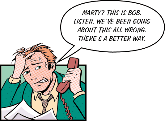
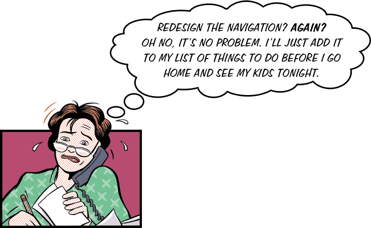
Man telephoning his co-worker in a panic

That’s much better

much betterGuess how much markup there is in this little table? 2.1k. There are 4 rows and 2 columns in this thing. And no spacer GIFs.
just rightAnd all of these dotted borders are done with CSS and are perfectly valid.
  • This is a list item now
  • Just the way it’s supposed to be
This is all done with 8 table cells and 4 CSS rules.Seriously. 8 cells and 4 CSS rules, that’s all it takes.
  • Hooray for bulleted lists
  • Why not just mark up your bulleted lists as bulleted lists and let CSS do the rest?
You need a rule for <table>, one for <td>, one for <ul> and one for <li>.That’s it. Once you have those you're golden.
  • I just love bulleted lists
  • Excellent! no more fake bullets

And here’s the CSS Code used to get rid of the bunk markup:

table{ border-bottom:1px dotted fuchsia; border-left:1px dotted fuchsia }

td{ padding:11px 20px 20px 11px; border-top:1px dotted fuchsia; border-right:1px dotted fuchsia }

ul { margin-top:10px; margin-bottom:10px; margin-left:0; padding-left:1em }

li{ margin-bottom:10px }

Policeman signaling for us to stop and think

Recapping transitional designs

Use margin and padding instead of extra cells and spacer GIFs.

Use link and @import styles. The first for old browsers, the second for modern browsers.

<link href="basic.css" rel="stylesheet" type="text/css">

<style type="text/css" media="screen"><!--
@import url(modern.css) screen;
--></style>

Real world examples:

But wait, there’s more:

For more information on transitional design, see chapter one of Eric Meyer on CSS and much of Jeffrey Zeldman’s Designing with Web Standards.

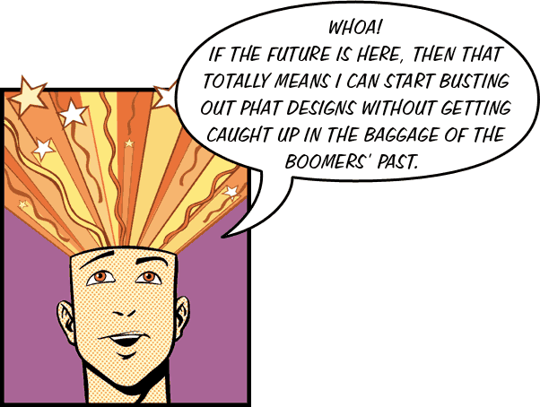
Young coder realizing that he does not need to use tables for layout

CSS layouts: the future is here

The browsers that the vast majority of viewers are using today have good CSS support. They all have their quirks, but once you get used to them, you can work around them.

Coding CSS is easy. Even for a guy like me who thinks that most JavaScript looks like swear words.

if(links[x].length > 0);{
for (y=0; y<links[x].length; y++) {

Every CSS rule has a selector and a declaration. The declaration is made up of a property and a value. Properties that sound like they should be 2 words are hyphenated.

body {margin:0; padding:0}

.related {float:right; width: 15em; margin-left:1em; margin-bottom:1em; color:blue}

#footer {color:gray; font-size:0.6em; line-height: 1.2em; background-color:white; margin:0}

Superhero flying to our rescue

Structural markup: code what you mean, mean what you code

While writing the actual CSS is simple, using CSS to do your layouts requires a slightly different way of thinking than most of us are probably used to.

Rather than thinking about things like "this goes here and this goes here" while we are working on a page or a layout, we need to think about the kinds of information in our page and the structure of that information.

We give the most important headline an <h1> tag; subheads get marked up with <h2> tags, etc.; and paragraphs are paragraphs.

This is what is known as "structural" or "semantic" markup.

Instead of putting your content inside of tables and table cells, wrap it in div elements. Give your div elements an id or a class that is descriptive of their content and/or function, rather than their appearance.

Chef preparing tag soup

Avoid <b>ed and <br>eakfast markup

Think about why you want something to appear a certain way; what does it mean? Your markup can and should convey meaning, even to someone who cannot see your page. Semantic markup makes our pages more accessible to everyone, including search engines.

When you italicize something, is that because you want to emphasize it, <em>, or because it’s the title of a book, <cite>?

If something is bold, it should probably be marked up as <strong>.

If you want a linebreak after something, chances are it should be marked up as a header element. If it’s not a header, is it part of a class that occurs throughout your site? If that’s the case then use CSS instead of <br>.

.foo {display:block}

To learn more, see Bed and BReakfast markup (B&BR) by Tantek Çelik.

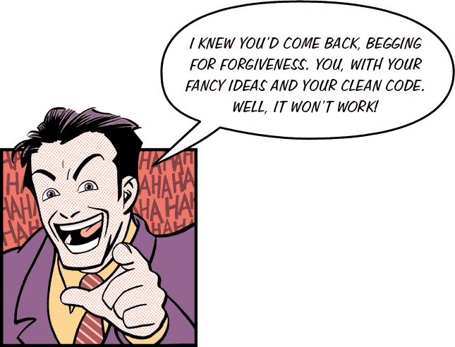
Evil villain mocking us

Things tables do better than CSS

There are certain things that CSS does not do as well as table layouts.

For instance, say you have a black side nav bar that you want to extend the whole height of your content. With a table layout, this is a piece of cake: just give that <td> a black background.

We can do this with CSS, but it requires a different way of thinking.

If we give our nav div a black background, the black will only extend until the nav 'runs out'. On most pages, the content is longer than the navigation, so this is no good.

Instead we could tile a black GIF in our content div and give this div enough left padding, but if our navigation is longer than our content, this won't work either.

Another way to tackle it is to tile the black GIF on the background of our <body>, which is fine unless you want to use another image for the background of your <body>.

Or, we can wrap our content in a 'wrapper' div and tile the image in that div. However, this is adding non-semantic fluff to our markup.

And, of course tiling background images won't work at all if you want the width of your navigation to be fluid.

Like we said, there are things tables do better than CSS. But in the end you need to ask yourself if all the baggage that comes with using tables for layout instead of data is worth it.


Friendly mailman

Migrating from table hacks to Web standards: the big picture

First, you need to decide on a migration strategy. Are you going to migrate the entire site at once, or are you going to do it on a section by section basis?

Identify the sections and pages that will most benefit from the conversion. Home pages, new product announcements, and similar pages are a natural place to start.

Identify the types of content/information in your site as a whole

Surgeon in the operating room

Breaking down your pages

Once you have a grasp on the types of content in your site, it’s time to analyze your existing pages for logical divisions of content.

Analyze your table structure for nested tables and empty spacer and border cells. (We want to replace these with div tags or with a much simpler table structure.)

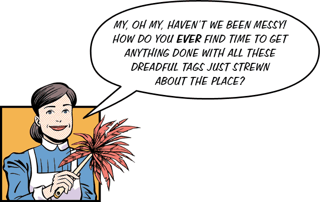
Passive aggressive maid

Look at your markup

Once you've analyzed the structure of your pages, it’s time to take a look under the proverbial hood and analyze your existing markup for presentational HTML that can be replaced with structural markup.

Fireman rescuing content

Replace presentational tags with structural markup

You can use find and replace (and regular expressions), but the easiest way to do it might be to view your existing page in a browser and copy and paste the text from there into your HTML editor.

Think about the structure of your document! Merely replacing <b> tags with <strong> tags is not enough.

What is the most important header? Mark it up with an <h1> tag. Mark your subheads with <h2> tags and so on. Mark up paragraphs with <p> tags. Mark up your navigation as unordered lists.

Choose a DOCTYPE and use it. (We recommend XHTML transitional, unless you're hard core, in which case, go for it and use XHTML strict.)

Clown

Divide your page into logical divs

Put your main navigation into a div with an id of mainnav; put your subnav inside a div with an id or class of subnav, put your footer in a <div id="footer">, and wrap your content inside a <div id="content">.

It doesn't look like much now, but once you start adding rules to your style sheets, things will get better quickly.

Two superheroes

It’s time to start writing your CSS

At the beginning, give each div a border. For example, div {border:1px dotted gray; padding:.5em} This will help you see where they begin and end, and also whether or not you have any nesting going on.

Write your CSS for element selectors first (<html>, <body>, <p>, <h1>, <h2>, <ul>, <li>, etc.)

Use contextual or descendant selectors as much as possible. This will keep your markup much cleaner. For example, #subnav li{border:1px solid black; padding:.5em; display: inline} will only affect list items that occur within your subnav div.

Test in as many browsers as you can and get your friends to test it in their browsers.

Paparazzi

Examples of sites that are laid out with CSS

Newsboy selling newspapers

Read all about it

Obviously, we can't cover everything you need to know about designing with CSS in an hour, but these books can help you come to grips with using Web standards to make your pages leaner, cleaner, and faster.

Painter at his easel

Paper? We don't need no stinking paper: Online resources

CSS-Discuss

zeldman.com The Daily Report: Insightful, thought-provoking, and well-written content and links served up regularly

A List Apart For people who make Web sites

The Web Standards project Bless these people.

CSS: A guide for the unglued A great links page

CSS Layout Techniques: for Fun and Profit Layouts that you can use in your projects from Eric Costello. Resources and tutorials, too.

Real World Style CSS layouts, tips, tricks, and techniques from Mark Newhouse.

The Business Benefits of Web Standards Good news for modern suits. The gospel of Web standards presented in terms that an MBA can appreciate.

Worker asleep at his computer

Thanks. Any questions?

Woman freaking out

Everybody loves stupid tables

(Well maybe not the actual tables themselves, but people sure seem to like this presentation.)

Thanks to the efforts of the people listed below, “Why Tables for Layout is Stupid” has been translated into all these languages.

If you'd like to translate it into your native tongue, . (Come on, Japan, where are you? How about you, Saudi Arabia? And don't tell me nobody on the entire Indian subcontinent understands the value of Web standards, or wants to read this in their native tongue. I ain't buying it.)

Updated layout: Responsive and using web fonts!

When Adam and I gave this presentation at the Seybold 365 conference in 2004, using CSS was still something fairly new. Browsers weren't nearly so good as they are now and most sites were still created using tables. Executives and coders alike still needed to be convinced of the wisdom of using web standards. That was the purpose of this presentation.

Obviously, a lot has changed in the eleven years since we had the temerity to call the prevailing method stupid. For example, there is no more Seybold and more people access the web on their phones than at a desk. What hasn’t changed is the humor we used to poke fun and provoke people into reconsidering the way they built their sites.

View the complete presentation all on one page here, or enjoy it in bite-sized nuggets. You can also read the blog post I wrote about the steps I went through to make the pages (and their translations) responsive.

—Bill

Note for users of Internet Explorer:

In order to properly view sites using non-roman alphabets (such as the Bulgarian and Chinese translations of this site), you need to change your Language/Fonts preferences so that the Default Character set is "Universal Alphabet (UTF-8)". This will not affect any of the sites you normally view and will give you access to a whole new world of sites in languages you probably can't read anyway.

; Scott Design Inc

; Adobe Systems Incorporated

Illustrations by Paul Gilligan

International Versions

We're going global! If English isn't your native language, check out our translations page. If you'd like to translate this into your native tongue, .

Creative Commons LicenseThis work is licensed under a Creative Commons License.

Scott Design